Motion Graphics Reel 2025
Motion graphics are animated graphic designs that transform static visuals into moving pictures, often used in videos and multimedia projects. They combine design principles and animation techniques to create visually engaging and informative content. In this blog post, I will walk you through how I created my very first Motion Graphics Reel.
The first step I needed was to gather the assets. You can’t create motion graphics without the graphics. I used my personal logo as the very first, then went to Adobe Stock to gather the remaining 7, giving me a total of 8 motion graphics animations.

With my graphics selected, I then had to give them some kind of theme. I would attach fake company names and slogans to each logo that did not have one already. I would then treat these “companies” as if they were clients commissioning me for work, and shape the animation around that. I would ask the question, ”what kind of animation would this company want for their logo?”
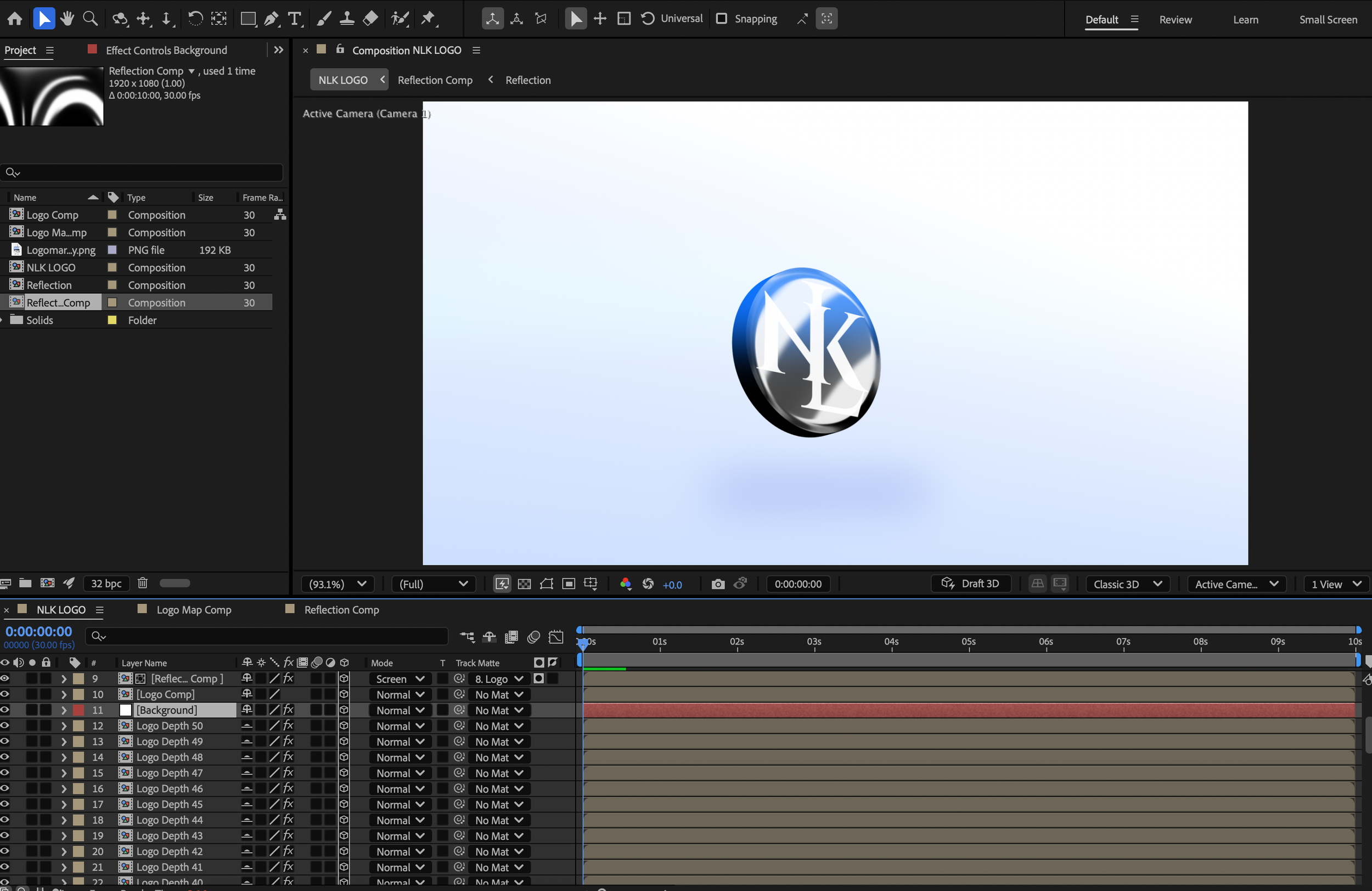
NLK Logo
The first logo I worked with was my own, as it would make for a nice introductory piece. My logo is very simple in comparison to the other ones, so I decided to go with a simple animation to match. I went with a short sleek 3D animation. The logo itself is not a true 3D model, but is multiple copies stacked on top of each other. To accomplish this efficiently, I used the expression [position[0],position[1],index+1]. This expression makes it so when the layer it is applied to is duplicated, that duplicate is moved back 1 in z-space. I then made up to 50 copies of the logo, which created the illusion of a 3D model.
For the following 7 logos, I also gathered some stock footage that related to each company. This was done so that I could showcase my ability to transition logos to content.
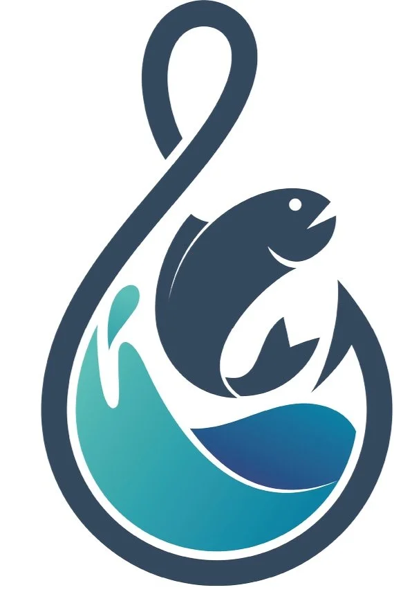
Hooks: Fishing Group
For this logo I wanted an aquatic theme, to match the fishing aesthetic. I decided to grab some drone footage over some water and place the logo under the water using the 3D camera tracker tool. The 3D camera tracker is simultaneously the most fun and the most infuriating tool After Effects has to offer, as it is also the most finicky. If your footage isn’t made with tracking in mind, it becomes a toss up if you can get your desired result. If it works, it allows you to attach elements to the environment as if they were actually there. In my case, the tracking worked, so I got the effect I desired.
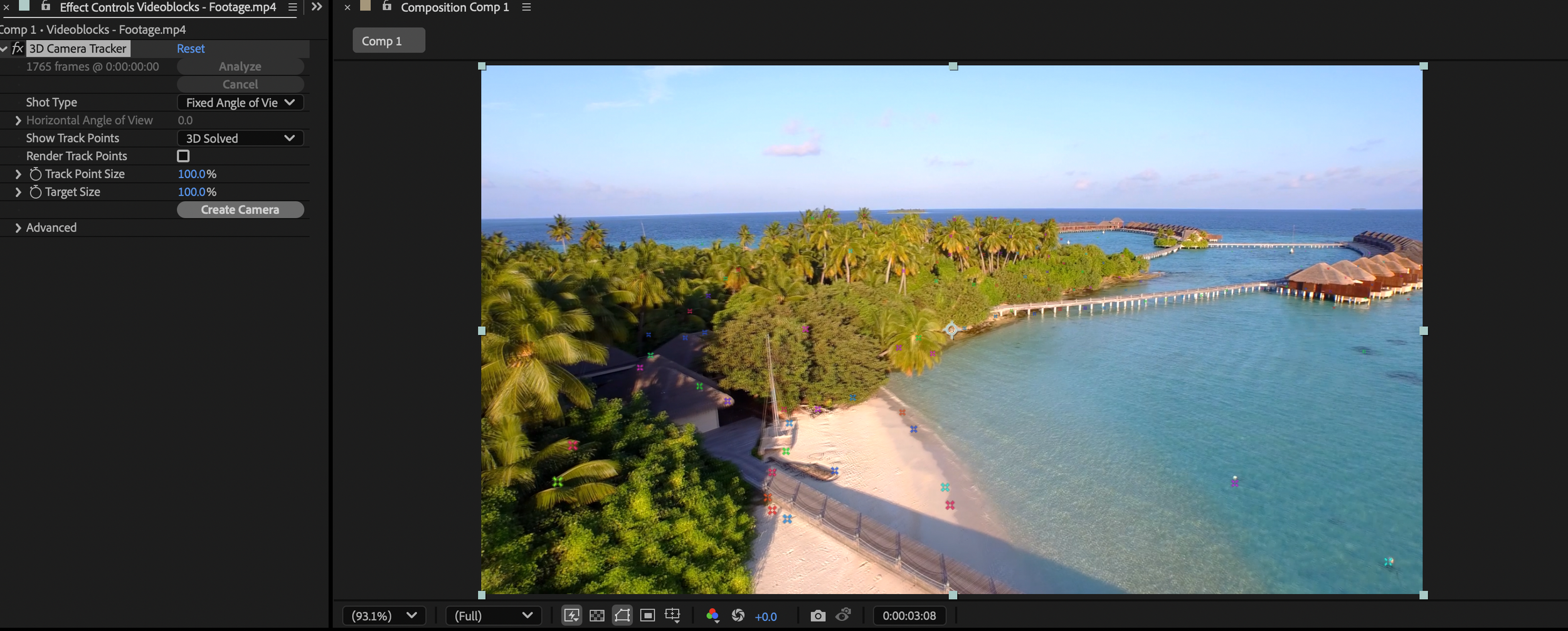
Tracking points on footage
Once I had my tracking points set and the logo placed where I wanted it, I applied the wave warp effect to the logo to help make it look like it was underwater. The final part was to add a whip pan transition into some footage of someone fishing, and this animation is complete.
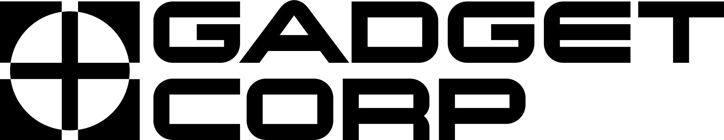
GadgetCoprp
The design for this logo animation comes entirely from the name, it just makes me think sci-fi and lights. An inspiration I took for the animation was TRON, with the blue lighting used to add the sci-fi look I wanted. This project was very similar to my own log animation, with it using many of the same effects. But there are 2 elements that distinguish the two. The first is the rows of glowing blue logos above the main logo. This was achieved using the Vegas effect, which essentially animates a tracing effect around any thing you apply it to. I used the same expression to create the illusion of 3D depth on both the logo and the Vegas layers, however for the Vegas layers, I made it so instead of moving back 1 point in z-space with each duplicate, it would move back 3 points. This gave it a almost wireframe effect that I was very happy with.
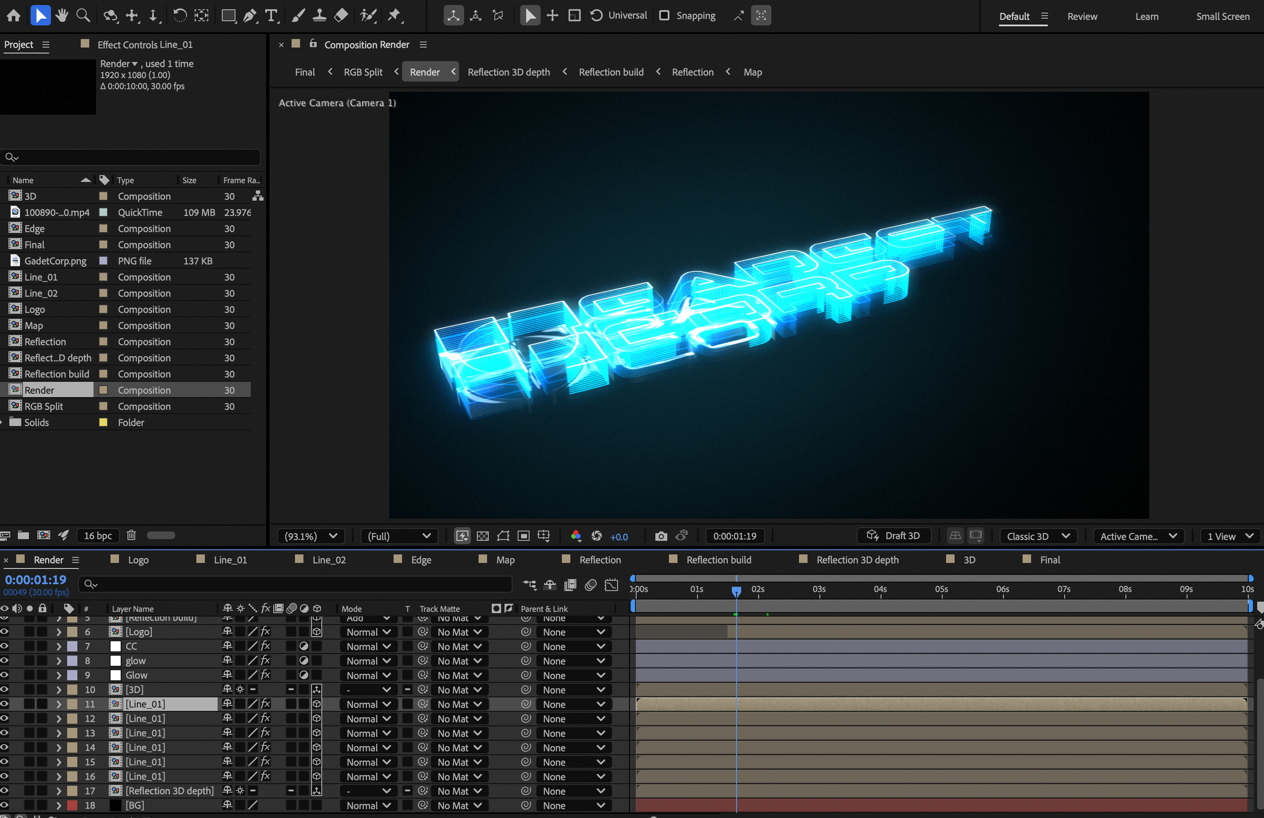
For the transition, I used an RGB glitch effect to transition to some footage of old gadgets.
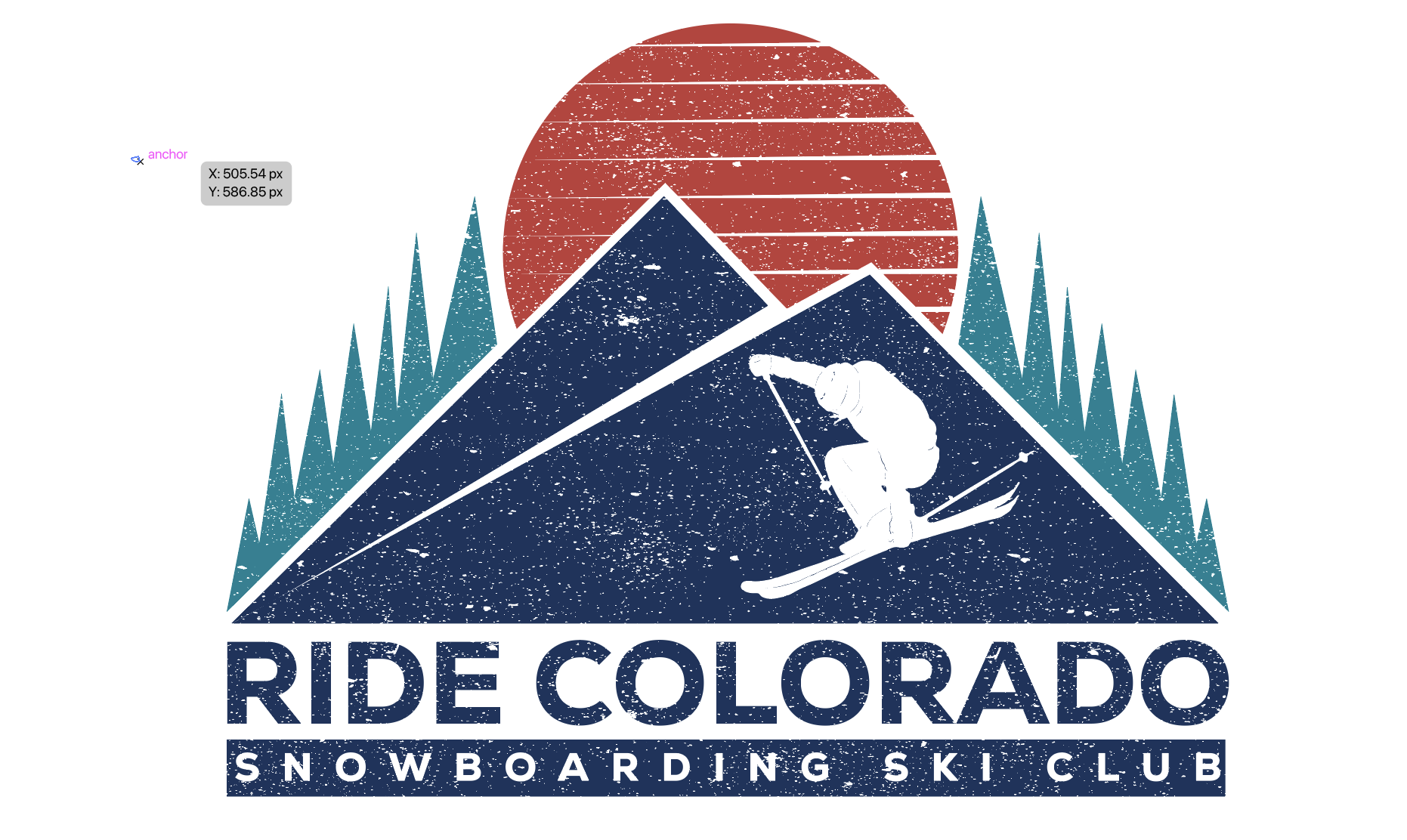
Ride Colorado
This was one of the logos that already had a name and tagline, which made coming up with the theme very easy. The problem was how to execute the theme. I eventually came up with the idea to have the logo get revealed through ice, capturing the cooler/winter theme without being too Christmas.
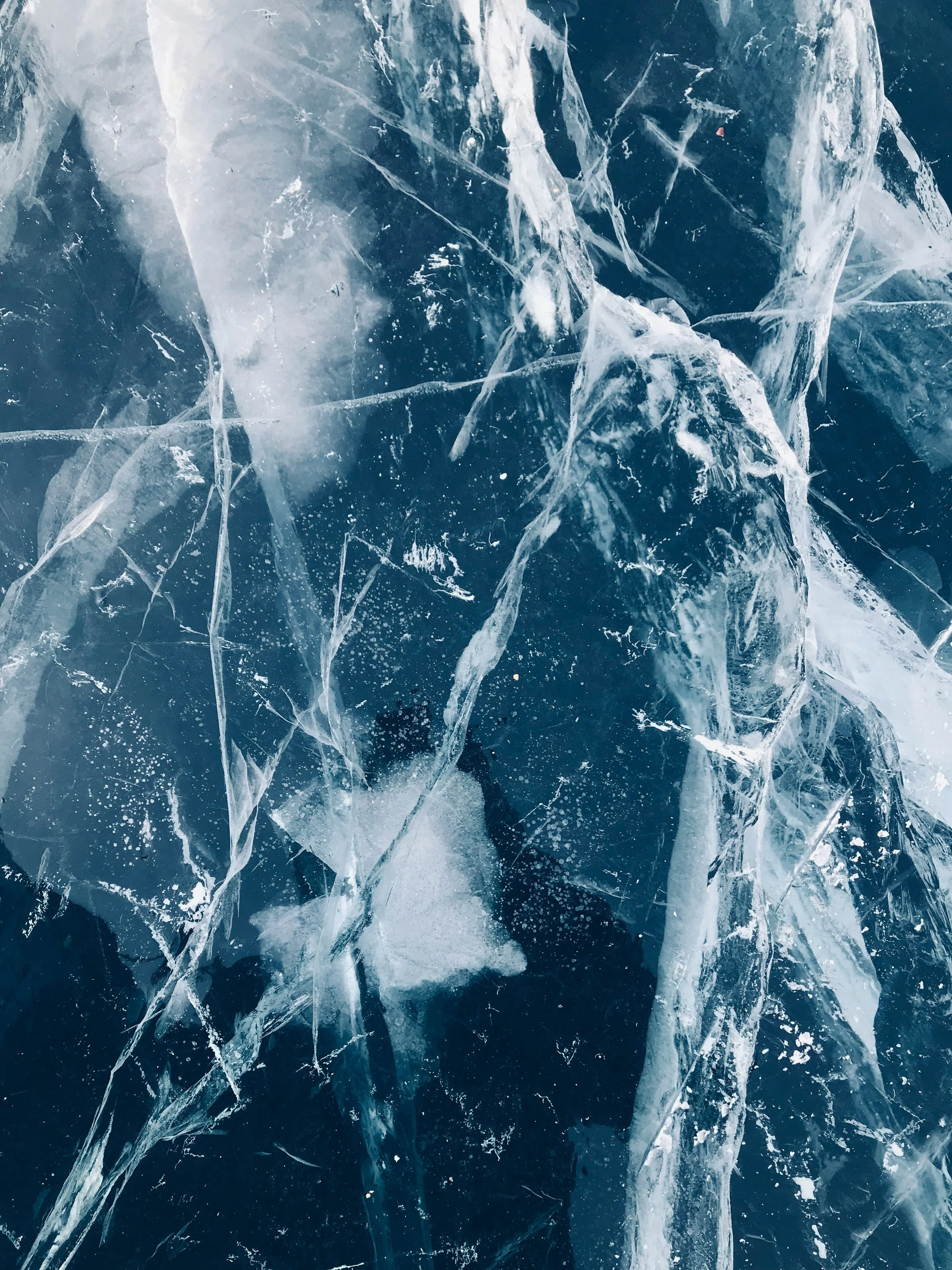

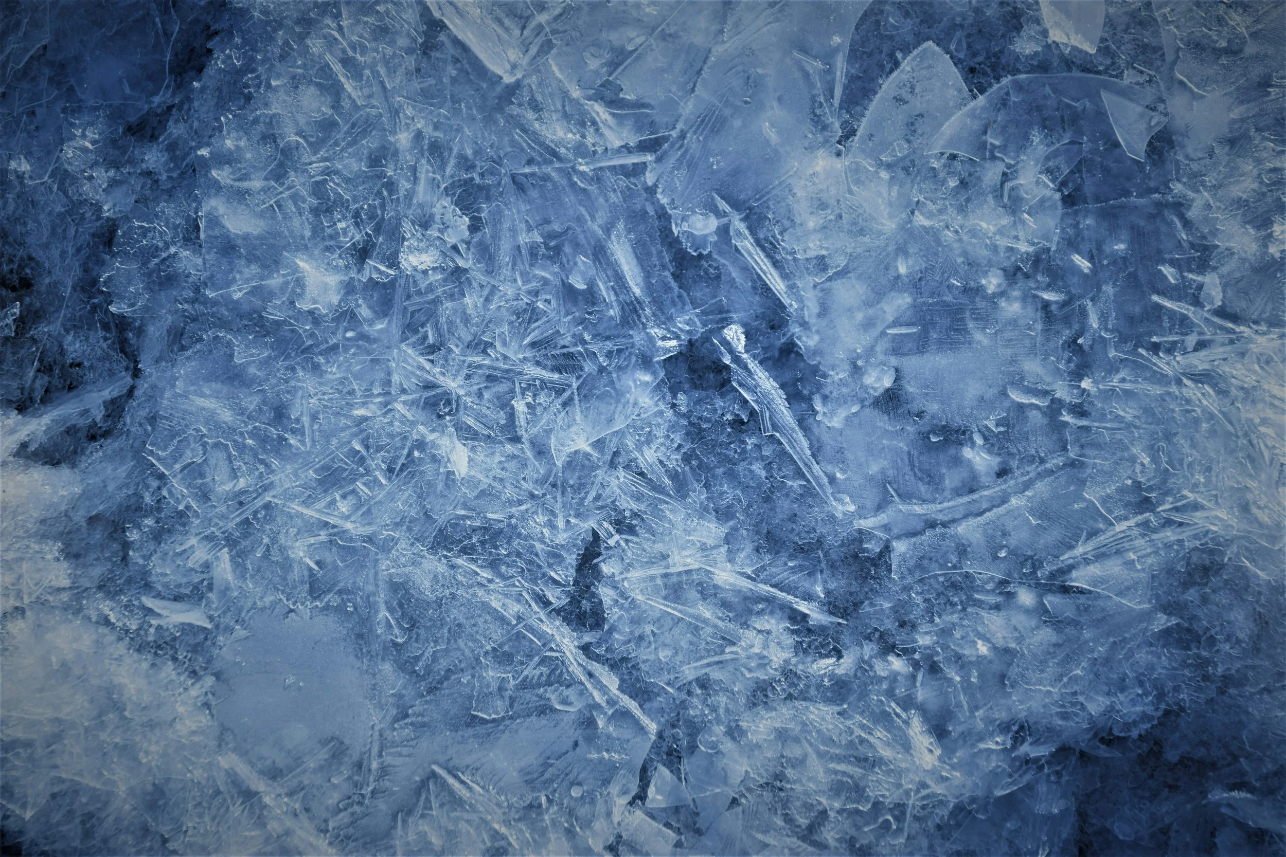
The layer assets used to create the animation.
Once I had the assets gathered, I layered them and the logo in a composition. I applied the displacement map and compound blur effects to the logo and used layer styles to create the reveal effect. The last step was to create a blur transition into the footage of a snowboarder.
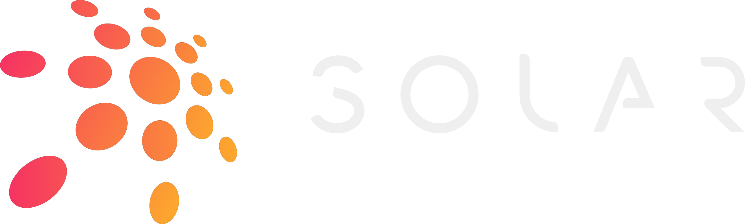
Solar
The design for this animation came from the name and the footage I paired with it. They both gave off a club vibe, so I want with a flashing neon theme. To achieve this I used the After Effects plugin Saber. Plugins for AE are third party mods that add effects to the program. Saber is one of the most popular free plugins. It is used to create laser effects and even lightsabers, hence the name.
I would apply up to four different Saber layers to the logo, each with their own colors and emitters to create a dynamic reveal effect.

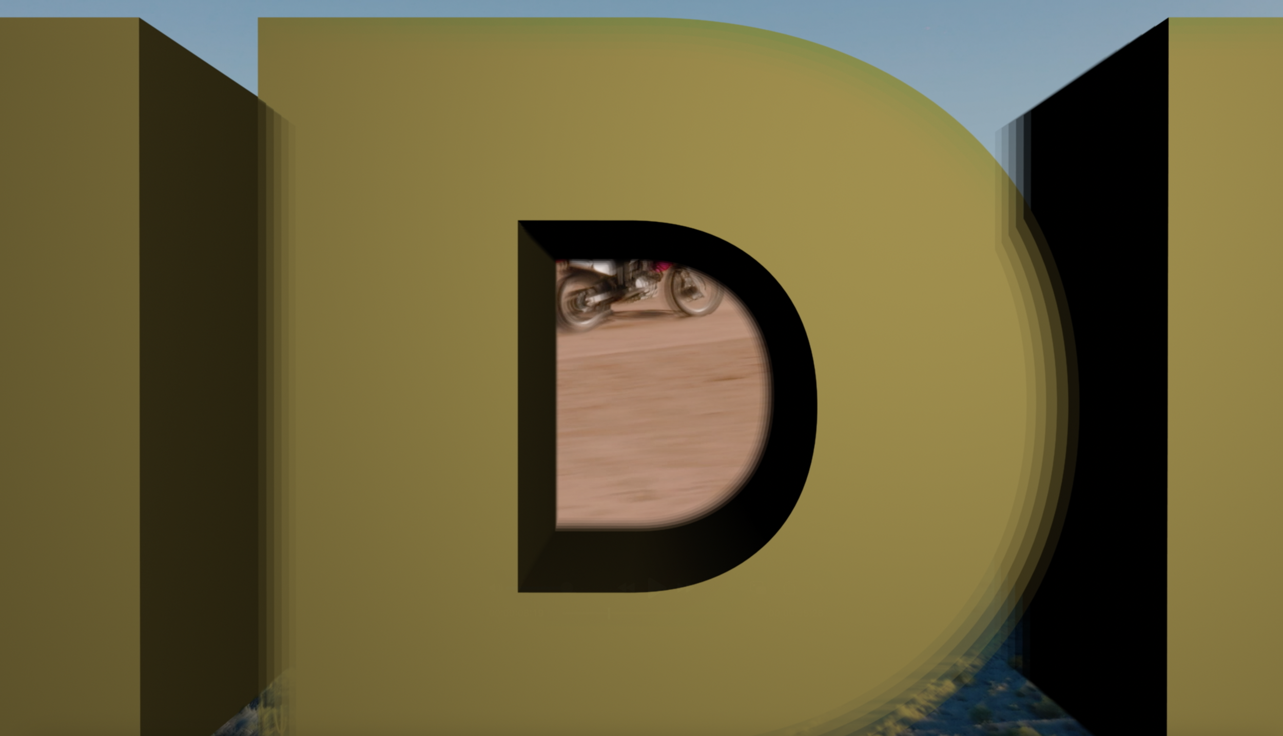
Rough Rider
This animation got its theme from the logo, which is just the words “Rough Rider”. That name immediately made me think of dudes riding dirt bikes in the desert. I decided to do a bit more for this project, so I had 2 pieces of stock footage, plus 3D camera tracking, plus the logo animation at the end.
For the first part of the animation, I did some 3D camera tracking. I used some drone footage flying through the desert, and placed a text layer with the words “Rough Rider” on the tracking points. I would then have the camera fly through the D of rider and transition to footage of a dirt biker in the desert.
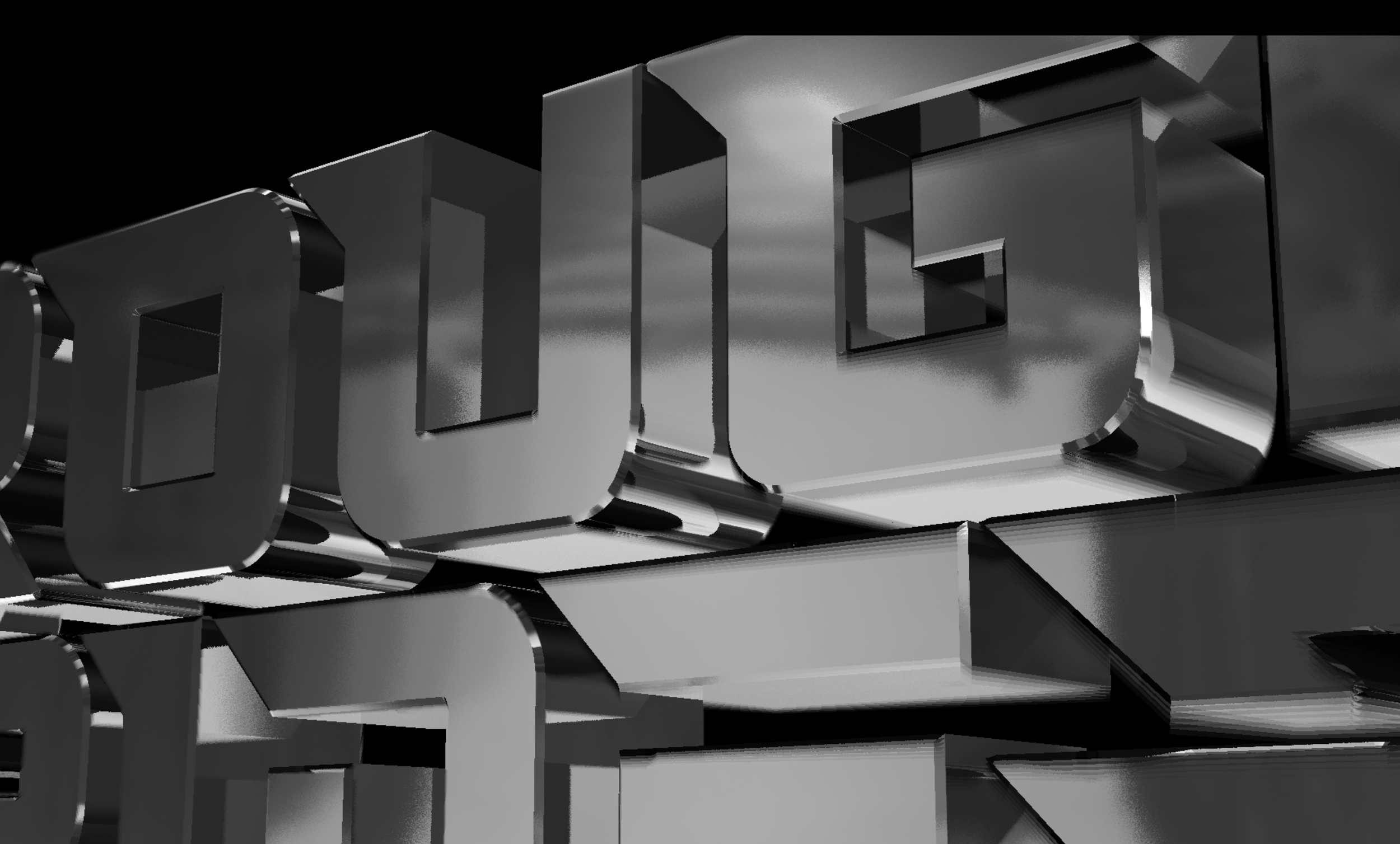
Following that I would make an echo transition to the logo animation. I turned the logo into a shape layer by using auto-trace to create a mask, then converting it into a shape layer. From there I was able to use 3D options to give it depth, such as extrude and bevel. I also gave it a chrome look, wanting the logo to ave a almost engine look to it.
The consequence of my ambition was render time. This short animation took two and a half hours to fully render out, longer than any other project I have ever worked on. After Effects render times tend to ballon quickly when 3D is introduced.
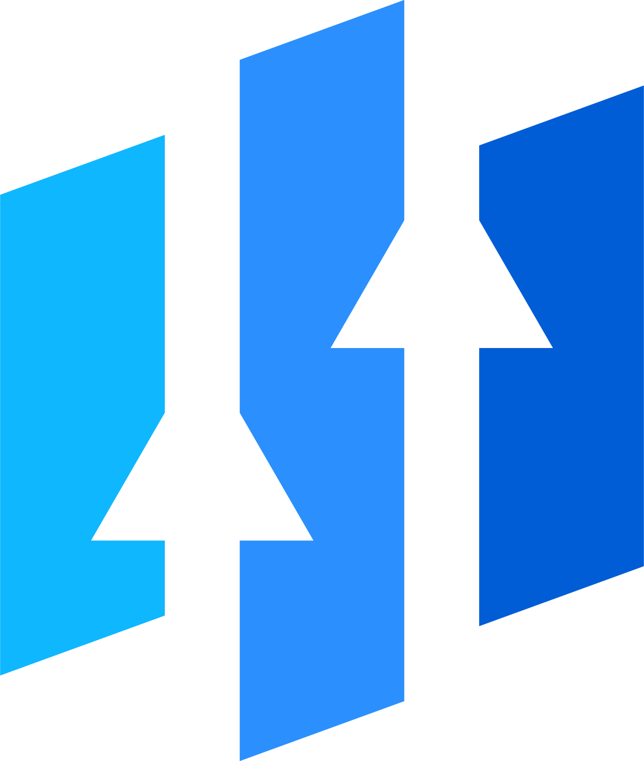
Upward
Adobe stock described this logo as a “financial logo” so that made giving it a name and theme simple. I choose to name it Upward due to the arrows in the logo and gave it a basic slogan.
After that I had to ask the question, “What kind of animation would a financial consulting firm want for their logo?” I believe that firms like this want sleek, professional, and clean work rather than anything more artsy, so that is what I set out to create.
I once again used the Vegas effect to create a trace outline of the logo, and used the same expression used on my logo and GadgetCorp: [position[0],position[1],index+1]
The final part of the animation was to move a camera in 3D space to follow the trace, and reveal the full logo at the end.
After that, I added a slide transition to the relevant footage.
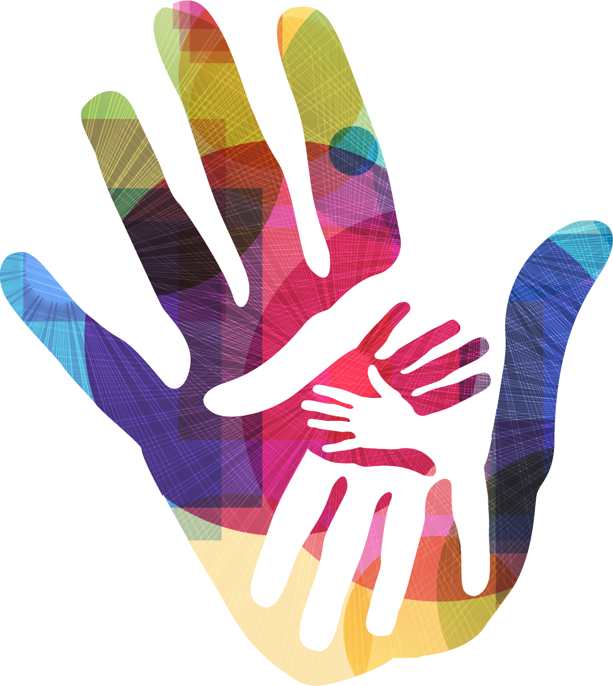
Finger Painter
This was the final logo I had to work with. The colorful design on the hand made my think of finger painting, so I theme the company and animation around art, particularly painting.
In order to achieve the paint explosion effect needed, I used the effect CC Mr. Mercury, Which is my favorite effect purely because of it’s name. It also gave a liquid explosion spread effect, which is cool too I guess.
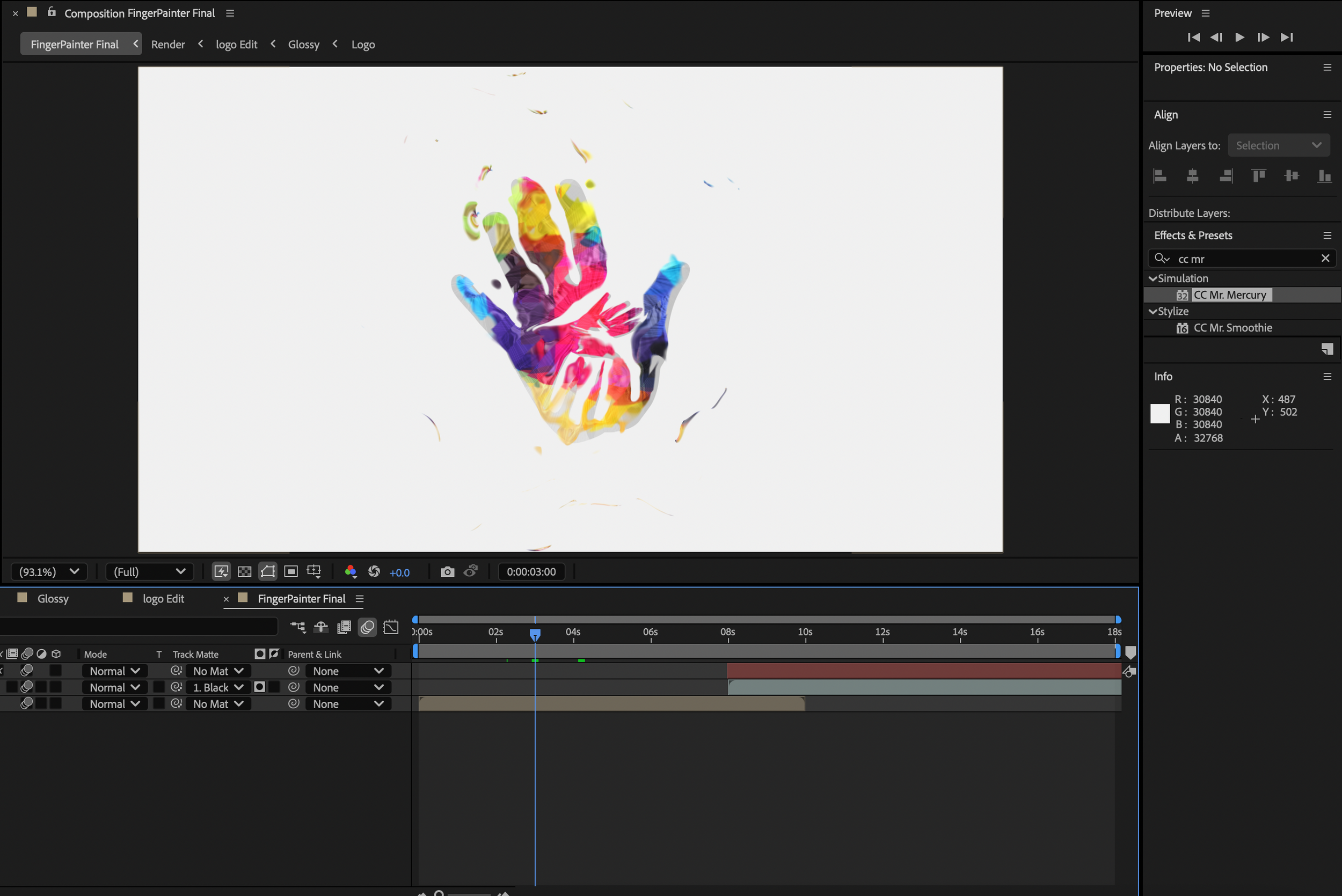
After applying the animation to the logo, I added a transition that made it look like the logo was being painted way by a brush, revealing the footage.
Once all the animations were completed, I gathered them in one After Effects file and added some nice music to complete my first ever Motion Graphics Reel.